

Somewhere between choosing the sofa and finding a rug, a picture can become an administrative task. There is a gap above the cushions. It needs filling. Preferably with something containing the right shade of green.
The result may be perfectly coordinated and strangely easy to forget. The picture agrees with everything, but adds very little of its own.
When people ask how to choose wall art, colour is often the first question. We would begin with a different one: what would you actually like to look at here? Then test the answer against the wall, the furniture and the distance from which you will see it. A painting can introduce an unfamiliar colour, a photograph can interrupt a formal room, and a small drawing can be the most compelling thing on a landing. None needs a matching cushion to earn its place.
Art does need company, though. The space around a frame, the height of a sideboard and the light across a surface can make a piece seem settled or inexplicably stranded. Those relationships are where the useful decisions begin.

An older painting in a sharper room
Rustic Houses Oil Painting · The Roost · UK
Rustic Houses is all loose edges, pale sky and orange roofs. That softness is precisely what makes it interesting beside glass, limestone and sharply drawn contemporary furniture. We chose it for the opening study because a modern home need not contain only modern-looking art. The narrow gold-painted wood frame provides a warm boundary without demanding more gold around the room. Confirm the vintage painting’s actual dimensions and availability before using it in your own layout.
Explore this piece in the Shop →The article brings together original diagrams, merchant product photographs and room studies. Shop links open The Room Study’s product pages, where the market and retailer are identified. We may earn a commission from purchases through their affiliate links. UK and US selections are shown separately; a shared aesthetic does not imply shared delivery coverage.
Before the picture, read the wall
Stand where you normally enter the room. The wall that looks largest on a floor plan may barely be visible from that position; a narrow return beside a doorway may catch your eye every day. Notice the view from the sofa as well. A picture placed for an impressive entrance can disappear behind a lamp once you sit down.
Architecture already divides the surface. A chimney breast, cornice, dado, window reveal or built-in cupboard gives it boundaries. Work with the usable area between them. Centring a picture on the entire wall is rarely helpful when the furniture occupies only one end. Above a console, start with the console; inside an alcove, start with the alcove. Then step back and judge the whole arrangement.
Leave some walls alone. If the view through a doorway is already full of shelving, patterned curtains and a strong picture beyond, another work on the intervening wall may simply make the journey noisier. An empty stretch gives the next thing you love a better chance of being seen.
Centre the relationship, not the whole wall

How big should art above a sofa be?
Size matters, but width is only one part of it. A dense black print carries more visual weight than a pale drawing in a generous mount. A thick gilt frame can make a small landscape feel substantial. A tall work above a long sofa may be convincing because of its vertical presence, even when it refuses the familiar width formula.
As a first mock-up, try an arrangement around two-thirds of the sofa’s width. For a 210cm sofa, that means roughly 140cm across the outside of the frame, or the complete group including its gaps. It is a starting rectangle, not a requirement to replace a picture you already love. The figurative oil painting later in this study takes another approach: its dense surface and strong vertical shape give a relatively narrow work real presence.
Tape paper templates to the wall before buying or drilling. Include the mount and frame, not only the printed image. Look from the entrance, then sit in your usual chair. Try a smaller and a larger version. If you have to explain why one works, but the other immediately feels right, the paper has done its job.
Oversized art can be wonderful when it is intentional. Give it enough viewing distance and a wall that can carry the gesture. A frame squeezed between two door architraves seldom gains authority from touching both.
Three scales, three different intentions

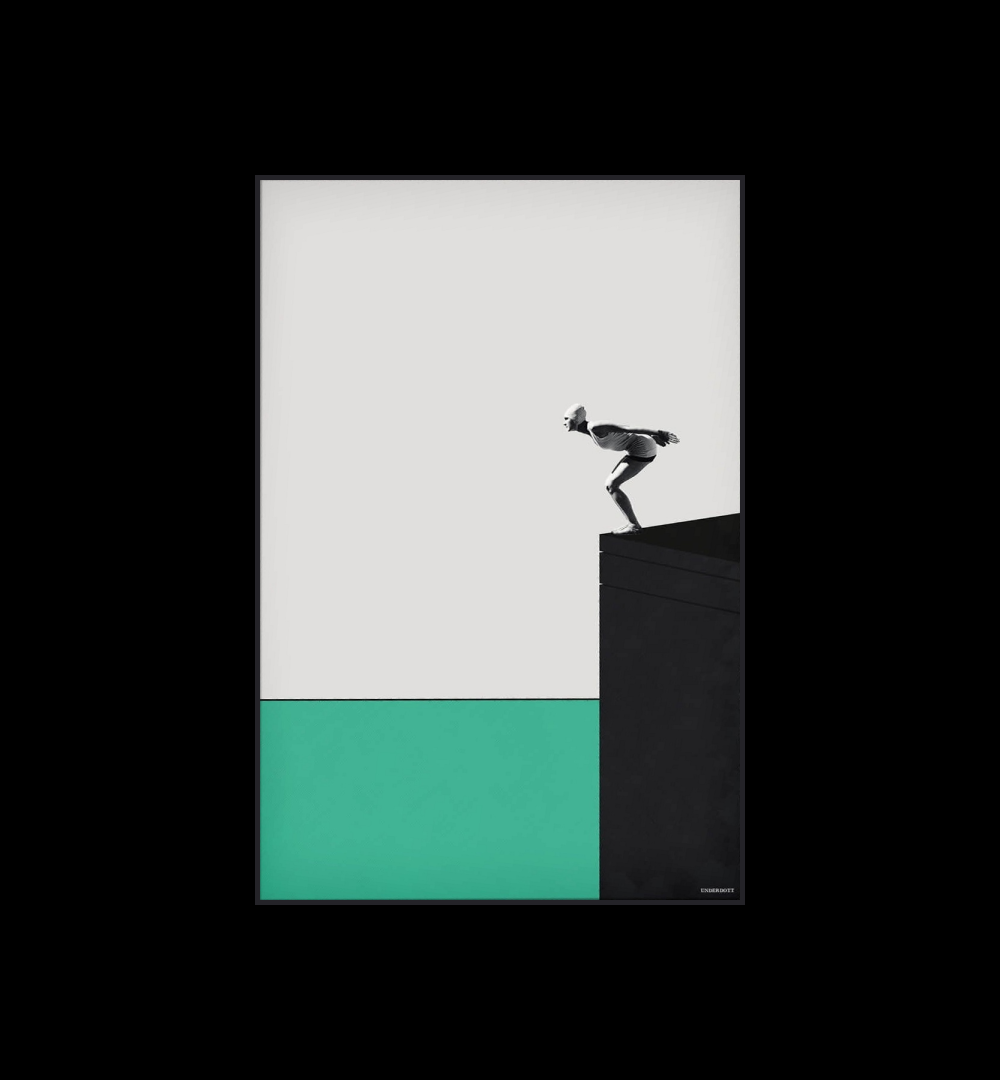
Let the empty part count
Dive into the Minimal · Big Wall Decor · US
Dive into the Minimal puts most of its action into one edge of a largely pale composition. Its tiny figure rewards a closer view, while the black platform and green band read from the doorway. That imbalance is precisely why we chose it: it shows how a picture can have visual weight without filling every inch. Leave clear wall around it and verify the actual print dimensions before planning a tall alcove.
Explore this piece in the Shop →
Quiet colour, strong rhythm
Nordic No. 8 · Big Wall Decor · US
Nordic No. 8 is restrained in colour but emphatic in pattern. Its striped planes would interrupt a soft room more sharply than a pale landscape of the same size. We would use that tension deliberately, leaving the neighbouring wall fairly calm. The catalogue image represents the design; the linked example option specifies its own material, size and frame, which should be checked before ordering.
Explore this piece in the Shop →Hang it for the view you actually have
On an open wall, a centre around 150cm from the floor is a useful first trial. Above furniture, the relationship to the furniture usually matters more than that centre line. Art.com’s hanging guide suggests roughly 10–15cm between a sofa or cabinet and the bottom of a frame. Start there, then check head clearance, the shape of the back and how the picture reads when seated.
In a dining room, much of the looking happens from a chair. A slightly lower arrangement may feel more companionable than one positioned for someone standing beside the table. Above a bed, allow comfortable clearance above the headboard and use fixings appropriate to the wall and the work’s weight. A mantel needs similar judgement: measure the usable wall above it, consider heat, and avoid pushing a picture towards the ceiling simply to clear a forest of objects.
There is no single height that resolves a staircase. Test the view from each landing and the main approach. A group can follow the rise, while one larger work may belong on the level wall at the turn. Keep the handrail and the route itself clear.
The room can take a colour it does not already own
Matching is one relationship among many. A warm pink can be lively against a cool blue wall; a chalky cream can give a saturated print room to speak; a dark background can gather a busy image into a calmer whole. You are judging the encounter, rather than asking whether two swatches are identical.
In the study below, the artwork stays the same. Against a pale wall, the green field feels crisp and separate. Against a deep red-brown, the warmer fragments of the flower become easier to notice. Neither choice requires new cushions. The wall changes the conversation.
Try the actual work, or a sample of its colours, in the room’s morning and evening light. A screen cannot reliably predict paint, paper or glazing. Also look at what happens when the lights are off elsewhere: a pale mount may become a strong rectangle on a dark wall, while a darker image can recede.
If you want to repeat something, repeat a small note and let the material change. A rusty mark in a print might find company in worn leather. A cool grey could sit beside stone. Repeating every colour with equal enthusiasm tends to make a room feel assembled around a shopping list.
One picture. Two different relationships.

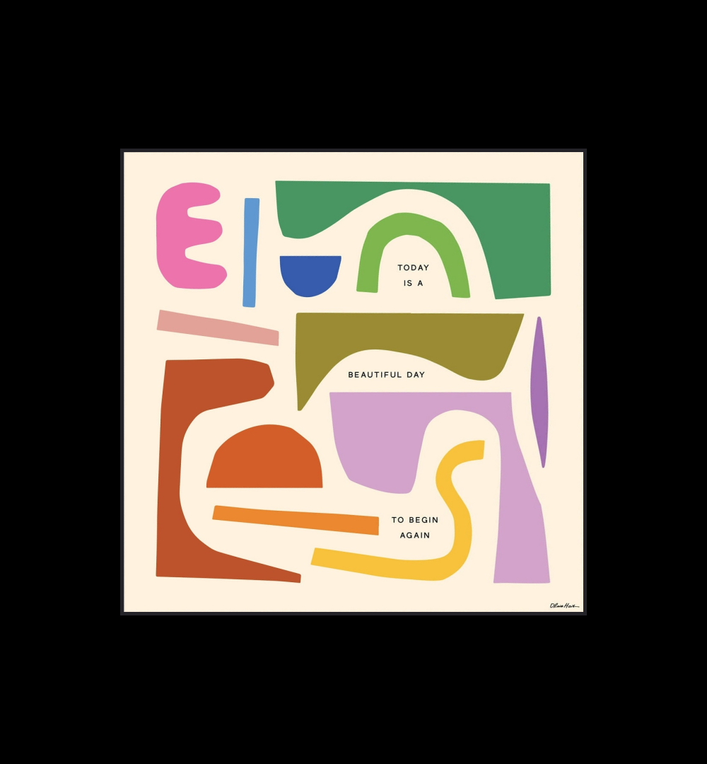
Colour without a checklist
Begin Again · Big Wall Decor · US
Begin Again gives several colours room to coexist without distributing them evenly. The large cream passages matter as much as the pink and rust shapes: they let the eye pause. We would give this busy square a relatively quiet wall and resist buying an accessory for every colour. The Shop listing is one example option; check the chosen size and finish with Big Wall Decor.
Explore this piece in the Shop →
One new colour is enough
Lotus Print - Green / A0 · The Roost · UK
Lotus brings a dense green field and a many-coloured collage flower into the room. We chose it for the side-by-side colour study because its green can hold its own against both pale lilac and deep red-brown. Neither wall has to repeat the flower’s colours. The original merchant image is identical in both panels, making the surrounding colour the only variable. The selected Shop record is the green A0 print; check framing and delivery options with The Roost.
Explore this piece in the Shop →Sometimes the room really can start with art
That approach is useful when a room feels stalled by too many sensible options. One work you care about can narrow the decisions without making all of them for you. Follow its mood, its contrast or the way it handles light. You do not have to turn the entire image into a decorating scheme.

Let the picture complicate the palette
Mid century oil painting · The Roost · UK
This mid-century oil painting contains a room within a room: two figures, patterned surfaces and a strong vertical composition. Cobalt, terracotta and ochre are already in conversation, so there is little reason to extract one colour and repeat it obediently. We would let the painting be the busiest surface in a quieter corner. The Roost lists it at 94 × 53.5cm including its original frame, a useful scale for a narrow wall rather than a substitute for an oversized canvas.
Explore this piece in the Shop →One large work, or a gallery wall?
A single work gives the eye somewhere definite to land. It can be especially useful where the architecture is already busy: a room with deep cornices, bookshelves, doors and a fireplace does not always need a second collection of small rectangles.
A gallery wall offers a different pleasure. It lets a room accumulate photographs, drawings and things kept for reasons that have little to do with decorating. The risk is not variety. It is a group that has no readable shape from across the room.
Lay the pieces on the floor and find a shared outer boundary, a centre line or a larger anchor. Keep most gaps reasonably consistent; vary them only when the group becomes better for it. Include the frames when measuring. Two pictures that seem comfortably spaced as paper prints can become awkward neighbours once their mounts arrive.
You need not buy a complete group at once. Leave room for something found later. A gallery wall becomes more interesting when its contents have different reasons for being there, provided the arrangement still gives them a way to live together.
A place to land, or a collection to explore


A small work with presence
Coastal Poplars Oil Painting · The Roost · UK
The dark and gilt frame gives Coastal Poplars a weight that its delicate trees alone would not supply. It is a useful reminder that a smaller painting can hold a wall at close range. We would try it beside a reading chair or on a landing where the brushwork can be seen, rather than enlarge its apparent role with a crowded collection of ornaments. This is a vintage work; confirm that the individual painting remains available.
Explore this piece in the Shop →
An intimate view
French Botanical Illustration, 1950s - 1 / Green · The Roost · UK
This French botanical illustration asks for a different viewing distance from a large abstract. The slender stems and pale paper suit a place where someone pauses: beside a desk, above a small chest or on a landing. Its oak frame has enough definition without enclosing the delicate drawing in a heavy dark border. We would keep this work on paper away from direct sun, splashes and steam.
Explore this piece in the Shop →The frame is part of the picture’s weight
A fine black edge can sharpen a pale work and pick up the dark lines elsewhere in a room. Oak may soften the transition between paper and wall. Walnut can add a deeper, warmer boundary. A gilt frame brings light and a little formality, but does not oblige you to furnish the room historically.
The mount changes the apparent size too. A broad pale margin gives a small drawing breathing space and creates a larger object on the wall. It can also become the loudest part of an arrangement. Try a sample beside the image instead of assuming more mount always means more importance.
Our frame comparison is a schematic study of colour and proportion, not a menu of finishes supplied with the products. Check the listing: prints, fabric systems, framed paper and original paintings arrive in different ways. The frame that looks right in an illustration is not necessarily included in the price.
The edge changes the weight


A horizontal breath
Haystack Rock · Big Wall Decor · US
The low horizon and dark mass in Haystack Rock make a quiet horizontal composition with one clear point of attention. It would be worth testing above a long console where the whole scene can be seen from across the room. The peach light can sit beside dark wood without needing a matching peach cushion. The linked Shop record is a particular example size, not a promise that every illustrated wall can use it unchanged.
Explore this piece in the Shop →
Texture can do the work
Pemali Woven Jute Wall Art · Nkuku · UK
Pemali offers an alternative to adding another painted or printed colour. The woven field and exposed threads cast small shadows, bringing interest to a quiet wall through material and relief. We would place it where gentle side light can describe the surface, with breathing space above a console or bench. Its natural mango-wood frame and jute construction come from the merchant record; the surrounding furnishings in the merchant photograph are not included.
Explore this piece in the Shop →The wall you pass may deserve the better picture
A hallway gives art a sequence of encounters. A small work beside the coat cupboard is seen close up; a stronger image at the far end draws the eye through the house. Place either where an open door will not hide it. If there is a console, keep the lamp below the picture’s important details rather than letting the shade obscure half the work.
Landings and shallow alcoves often suit intimate pieces better than a formal living room does. You can stop in front of a drawing without leaning across a sofa. A small painting may acquire more presence on a narrow wall than it ever had above a large piece of furniture. Our attic bedroom study takes the same architectural approach: the awkward parts deserve a decision of their own.
Kitchens and utility rooms are worth looking at with fresh eyes. A dry wall beside a breakfast table, or a sheltered spot opposite the laundry cupboards, can hold something more personal than another functional notice. Keep vulnerable paper and textiles away from direct sun, steam and splashes. The Canadian Conservation Institute’s guidance on works on paper is a useful reminder that a beautiful position also needs to be a suitable one.
The more practical the room, the less the picture needs to explain its purpose. A kitchen does not require a painting of a lemon. If you want one, choose it because the lemon is wonderful.


A little graphic interruption
Butterfly Framed Matchbox Label Print - Red / Oak / A3 · The Roost · UK
The red butterfly and turquoise field are a cheerful interruption on a quiet landing. We chose this print because its emphatic shapes remain legible in passing, while the vintage matchbox lettering gives someone who stops another detail to enjoy. An oak frame and white mount make a clear boundary against the yellow wall. The linked example is the red Butterfly print in oak at A3; check the retailer’s framed dimensions, since the paper size alone does not determine the wall space it needs.
Explore this piece in the Shop →A final look before you commit
THE FIVE-MINUTE ROOM CHECK
Five questions before you buy anything.
Stand at the doorway and answer honestly. Most rooms reveal the next useful move before they reveal the next useful purchase.
- 01Would I still want this picture if I changed the cushions?
- 02Have I measured the outside of the frame or the whole group, including gaps?
- 03Does the paper template work from the entrance and from the seat I use?
- 04Are lamps, door swings, glare and the route through the room accounted for?
- 05Have I checked the medium, frame, selected size and delivery market on the product page?
Then give yourself permission to take the picture down and try another wall. Placement is a decision you can revisit. A work that felt slightly lost in the sitting room may become the thing that makes a landing worth noticing.
There is a limit to what the useful rules can tell you. They can help with a frame that floats too high, a group that fragments a wall or a picture whose scale gets swallowed by the sofa. They cannot tell you why you keep returning to a particular face, landscape or odd arrangement of shapes.
Pay attention when that happens. The best reason to make room for a picture may be that you want to see it again tomorrow.
Further reading: Art.com’s guide to hanging height and furniture relationships; Artfinder on choosing and sizing a work; Canadian Conservation Institute: caring for art on paper. Dimensions in our diagrams are illustrative starting points. Product photographs remain the reference for the items sold; room scenes are design illustrations.
CONTINUE READING
More from the journal.

ROOM STUDY · COLOUR & SCALE
The room that starts with art
A geometric picture starts a blue living room. The colours matter, but so does the evening you want to spend beneath it.
5 min read
DECORATION
The house is getting dressed again
A skirt on a table, a generous curtain, a little more pattern. The return of dressed interiors offers something more useful than nostalgia: rooms with softness, depth and a place for the things we love.
9 min read